I draft a lot of patterns for tabletweaving, and the way I like to display the pattern includes both the turning directions and a guideline as to what the pattern should look like.
When I first started drafting patterns, I would work in pencil on gridded paper where each square represented one card in one row; first I would outline the main shapes, and then use a highlighter to add the turning directions for each card — highlighted for backwards, not highlighted for forwards. The biggest downside was that even at 5 squares per inch, a sheet of standard letter paper didn’t really hold room for a lot of cards. And heck, the squares could be smaller in any case.
I use computers a great deal, so casting around for solutions I experimented (briefly) with spreadsheets and discovered that this was too fiddly for me. Then I discovered Adobe Illustrator, which is a vector based graphics editor that has all the bells and whistles one could desire. Sadly, it also had a price tag to match, and I was at the time a graduate student, and student discounts are nice, but not *that* nice.
Which brought me to inkscape which is free, opensource, and available for Windows, Mac OS, and most importantly linux, aka my operating system of choice. Inkscape is a very powerful program, but I take advantage of a limited number of features.
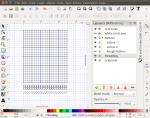
 I use layers extensively, as each part of the pattern is in its own layer, including the grid. In fact, I usually use the following layers from top to bottom:
- Grid lines – black grid lines 0.5 px wide
- White grid lines – white grid lines 3.5 px thick
- Pattern – one layer per colour to make colours easy to manipulate
- Colour 1 – line 3 px wide
- Colour 2 – line 3 px wide
- Rough Pattern
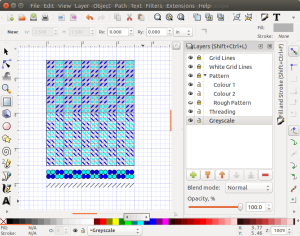
- Threading – the colour in the dots indicates the colour of thread in the two top holes.
- Greyscale – used to indicate the turning directions forward and back. Grey squares are turned towards the weaver, and white squares means the cards are turned away from the weaver.
Setting the layers up in this way allows me to take advantage of the order in which they’re drawn (bottom up) so that the diagonal lines I draw in the pattern colours become small individual diagonals.
 Once I have the layers set up and the grid built I usually save the file as a blank.svg file, so that I don’t have to keep rebuilding the grid.
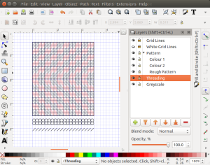
In this case, I’m planning a very simple pattern where the cards turn continuously in one direction until twist builds up, and then they reverse direction. I’ve roughed it in and now it’s just a matter of adding the colours.
 The basic design has all cards threaded the same way with two dark and two light colours, and we will be turning the cards forwards 12 times, and then backwards 12 times.
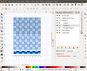
 In this simple variation, we have turned every second card around its vertical axis, so that half the cards are threaded from left to right, and the other half are threaded from right to left.
Hi. I just discovered this post today and I’d like to say that Inkscape is a great package for charting. One of the great thing about Inkscape is that it is extensible. I’ve been charting 3/1 twill patterns (one pack method) using GTT and then reading them directly into Inkscape using a script. It’s saved me a great deal of time and the charts look great.
That sounds really interesting, and I hadn’t realized that it was possible. Would you be willing to share your script?
No problem. Here are the links to the script and the import file:
https://www.dropbox.com/s/62vv1hfqqxtb0vt/gtt2svg.py?dl=0
https://www.dropbox.com/s/8fmw06i49coqo0p/gtt_import.inx?dl=0
These need to be copied to the share\extensions subdirectory in Inkscape. For example on my machine it would be C:\Program Files\Inkscape\share\extensions.
You should then be able to take a 3/1 twill GTT files (I know it works with a Z direction twill with S threaded tablets, not sure about other cases) and open it directly in Inkscape.
Here is an example input and output:
https://www.dropbox.com/s/jma7liyvbriz3fk/Caribou%20LF.gtt?dl=0
https://www.dropbox.com/s/79ou68o3quztzda/Caribou%20LF.gtt.png?dl=0
Note that I put ‘Z’ in for the card orientation to match the format of diagrams in Claudia Wollney’s books. These are the same as S threaded of course.
Ooooh. I like those. I wonder if we could also include the direction of the thread the way I typically do.
Sort of like this?:
https://www.dropbox.com/s/sbxia8kthb0v5f5/2016.png?dl=0
Yeah. Only your diagonals are all the same colour. I vary mine foreground and background. I usually get confused by the yellowish shading on top of the blue/white …